
Clean Slides, Clear Message – No Design Degree Needed!
In this post, you will learn to create cleaner layouts, better visuals, and more engaging slides. Whether you are building a sales pitch, visual storytelling slides, or internal report, these presentation design tips work across the board.
From choosing the right fonts and colours to smart data visualization, we will cover practical slide design tips to up your presentation game.
Using PowerPoint, Keynote or Google Slides? Not a problem. These presentation design tips are easy to apply. You don’t need a design degree, just follow these best practices!
Tips from Real-life Experiences
At Narratio Creative, presentation design is what we do. For over 10 years, we’ve delivered 500+ PowerPoint slide design decks for marketing leaders, founders, and CEOs across North America, Asia, and Europe.
In one project, we took a 30-slide investor deck full of bullet points and turned it into a data visualization presentation. The client secured a USD 89 million in Series B funding.
The slide design tips we share aren’t just theory. They are based on real-world experience designing for teams across industries like finance, luxury, healthcare, and technology. We’ve seen what works, and what falls flat. For example:
- Decks with minimal text and clear visuals always outperform dense, text-heavy slides
- Simply aligning content can make a huge difference in clarity and retention
- Inconsistent fonts, colours, or icon styles hurt your credibility, even if your content is solid.
We’ve tested these ideas in live pitches, webinars, and conferences. This is always true: Better slide design leads to better communication.
10 Slide Design Tips to Level Up Your Deck
01 Keep Text Minimal
If your audience is reading, they’re not listening. Stick to one main idea per slide. Trim your text fiercely. Less truly is more. Consider the “5-5-5” rule – no more than 5 lines, no more than 5 words, no more than 5 minutes.
02 Use Consistent Fonts
Pick two fonts max: one for headers, one for body text. Use styles (bold, italic) for highlight only.
Use consistent font size for header, sub-header and body to enhance understanding and keep the focus.
03 Stick to One Visual Theme
Use one colour palette, icon style, and image type throughout the deck. Presentation Design Templates can help here. A coherent visual language makes your deck feel polished and professional.
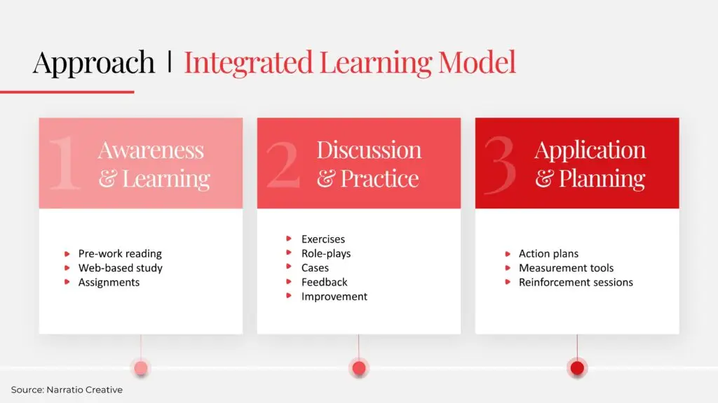
04 Use Infographics
Infographics are great to simplify complex ideas, playing an important role in visual storytelling. They can visualize processes, timelines, or relationships, so your audience can grasp at a glance. PowerPoint SmartArt or design sites like Freepik are great tools to make infographics.
05 Align Everything
Misaligned text boxes and images scream “amateur.” Use PowerPoint gridlines and alignment tools in PowerPoint. Precision equals professionalism.
06 Use White Space Wisely
Don’t crowd your slides. Space helps your message stand out. The more important the message, the more white space around it. It’ll naturally guides the eyes to stay and ponder there.
07 Visualize Data
Use clean, readable graphs with clear labels. Delete useless elements such as gridlines or data labels, so the key insights can shine. Presentation Design Tools like ChartBlocks can help you make data visualization in presentations pop. You can also use dashboards to visualize data.

08 Avoid Bullet Point Overload
Mix it up. Try icons, flowcharts, or images to explain ideas. Limit bullet points to 3 per textbox. Too many makes your slide look like a Word doc.
09 Add Simple Animations (Sparingly)
Use subtle transitions to direction attention, not distract. Fade in key points or zoom in on charts, but skip the flying text and spinning titles.
10 Test on Real Screens
Always preview your slides on different screens. What looks great on your laptop might be unreadable on a projector or phone. Check contrast, font size, and layout.
Why These Work
These best slide design practices aren’t just theory, they work in the real world. They’re built on proven audience engagement strategies and refined over years of experience. Whether you’re pitching investors or presenting to your team, applying these tips gives your ideas the best chance to land.
Take It Up a Notch
With Narratio Creative, you get:
- A 100% satisfaction guarantee
- Encrypted file transfers
- Professional slides designed to convert
From PowerPoint slide design to Keynote decks, we help you show up looking sharp and sounding clear.
Let’s Make Your Slides Shine
Want help applying these slide design tips to your next deck? Book a free 15-minute consult with our design team today, and get slides that actually work.
More Questions?
What makes a slide design “best practice”?
A good slide is all about clarity, consistency, and connection with your audience. Best practices keep your audience’s focus on what matters most – your message.
Can I apply these tips in PowerPoint and Keynote?
Yes! All of these tips work in both tools, and even in online platforms like Google Slides.
Do I need special software or skills?
Nope. These are quick-win tips. You can use whatever tools you prefer.
How many of these tips will work for corporate decks?
All of them. These tips are built for effective messaging; they are particularly relevant in business setting.
What’s the fastest way to update an existing deck?
Start with text reduction, consistency, and alignments. These are the fundamental rules for professional slides.