
Spice Up Your Stats — Charts Made Simple
This post reveals five simple presentation design techniques. You’ll learn to make complex data clear and exciting. Our go-to data visualization technique? Storytelling with charts. Spice up your storytelling by letting the numbers speak for themselves.
Charts help break down your information. They also give your audience interesting visuals to associate with the information. With the following tips, it won’t be a complicated process either. Perfect for beginners or pros, these tips boost engagement and leave your audience wanting more.
Trusted by Analysts and Decision Makers
At Narratio Creative, we’ve spent over 10 years perfecting presentations. We know the importance of visuals to an effective data presentation. Our data visualization techniques have helped clients like J.P. Morgan increase conference engagement by 50%. Using data visualization tools and the latest design strategies, we transform complex information into beautiful and impactful visuals.
For YAS Insurance, we used visual storytelling to lift conversions by 30%. Check our case studies! Whether it’s a report or a whole deck of statistics, our visual storytelling helps to transform plain data into insights that spark action.
Turn Your Charts into Powerful Visuals
01 Choose the Right Chart Type

What would you like people to take away from your presentation?
The chart type you choose can make or break your data. The right chart type is relevant to your end goal. Bar charts are great for comparisons; line charts work best for trends, and pie charts show proportional data. For example, show market share with pie charts because it represents data in slices relating to a whole.
02 Highlight Key Data Points
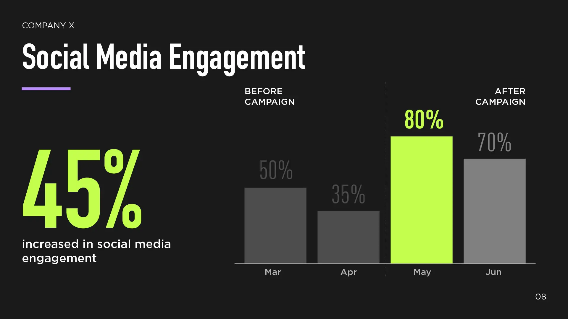
Get familiar with your data and bring out what’s important. Use bright colors or arrows to highlight big numbers or key takeaways.
Pro tip: High-contrast colors grab attention especially quickly – make sure to include them as accent colors in your presentation for making important information pop. It adds extra impact while also guiding the viewer’s focus immediately.
03 Create a Narrative Flow
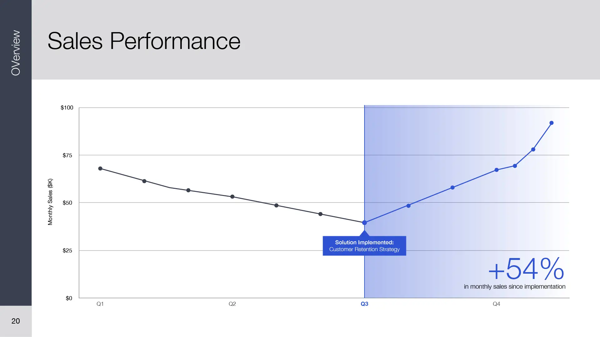
Arrange your charts to tell a story: problem, data, solution.
A narrative flow makes information processing much easier. Having evident milestones in your data will be especially memorable. Take sales data, for example. You can first show the sales drop, indicating a problem. Then, you can show the sales data rise after the solution has been implemented.
04 Use Visual Metaphors

Make your data more straightforward with visual metaphors.
Adding fun, relevant graphics to accompany heavy data helps get your main point across quicker and keeps your audience interested. This can be in the form of icons—like a rocket to represent growth.
Pro tip: Keep it simple, visually consistent, and related to your data’s message.
05 Incorporate Data Animations

Reveal data step-by-step with motion.
Displaying all your data at once can be a lot to take in. Using simple animations to introduce your data adds more to the presentation flow. This makes it easier to follow and understand.
Pro tip: Animations work especially well in PowerPoint or online decks. Get creative with the simple default animations or slide transitions in PowerPoint. There’s a whole library to choose from!
Key Features We Love
For the Beginners: Chart Design
Choosing the Right Chart Type is quick to learn and super effective. If you’re lost on what chart type to use, check out this comprehensive chart type guide for impactful visuals. Additionally, there are plenty of free online resources available to help you get familiar with the many different chart types.
With the right use of the data visualization tools you have on hand, simple chart design tips will take you a long way.
For the More Advanced: Data Animations
Data Animations shine in effective data presentation for big datasets. Take the time to get familiar with the PowerPoint animation tools to use them efficiently. Animations are especially helpful in guiding attention, aside from using pops of color in your chart designs.
Our key piece of advice: Keep the animations simple. Don’t let your animations overpower your data or your message.
Experience You Can Count On
Our experts tested these methods in over 500 presentations. We’ve found that they work smoothly with tools like PowerPoint and Google Slides. With our extensive visual storytelling experience, we leverage these tips to design the best charts for presentations. Proudly trusted by top brands across the U.S. and Canada.
Need Stunning Data Visualization in your Presentations?
Contact Narratio Creative at hello@narratiocreative.com or send us an enquiry to bring your figures to life.