Introducing the ‘Stacking Box’ Technique
‘Stacking Box’ is a simple yet powerful method that uses basic PowerPoint shapes to create versatile and perfectly consistent layouts.
For a professional presentation page layout, you have to make sure that:
- That size of each box is consistent
- The distance between each box is consistent

Our ‘Stacking Box’ method will help you easily create segmented boxes that are perfectly consistent in terms of size and distribution.
The concept is straightforward – you start by setting up your slides with a functional PowerPoint guideline system, then divide your content into one of these fundamental layouts:
- Columns layout
- Rows layout
- 2×2 layout
- Grid layout
- Full screen layout

Each of these layouts serves different purposes, and once you master the ‘Stacking Box’ technique, you’ll be able to create any of them quickly and consistently.
Let’s explore each one in detail.
#1: Columns Presentation Page Layout
The columns layout divides your slide vertically, creating parallel sections that guide the eye from left to right.
This versatile format can accommodate 2, 3, 4, or even more columns based on your needs.

Columns layout is particularly effective when you’re working with list-form content. If you have several bullet points or 3-4 key points with parallel importance, a columns layout will be your perfect choice.
Here is a real-life example of a 3-columns layout:

And here’s an example of a 4-columns layout:

Let’s create a columns layout using the ‘Stacking Box’ approach:
- Draw a rectangle on your slide, at random size.
- Hold Ctrl and Shift while dragging to duplicate it horizontally.
*Tips #1: Holding Ctrl + dragging will duplicate the object.
*Tips #2: Holding Shift + dragging will move the object horizontally or vertically only.
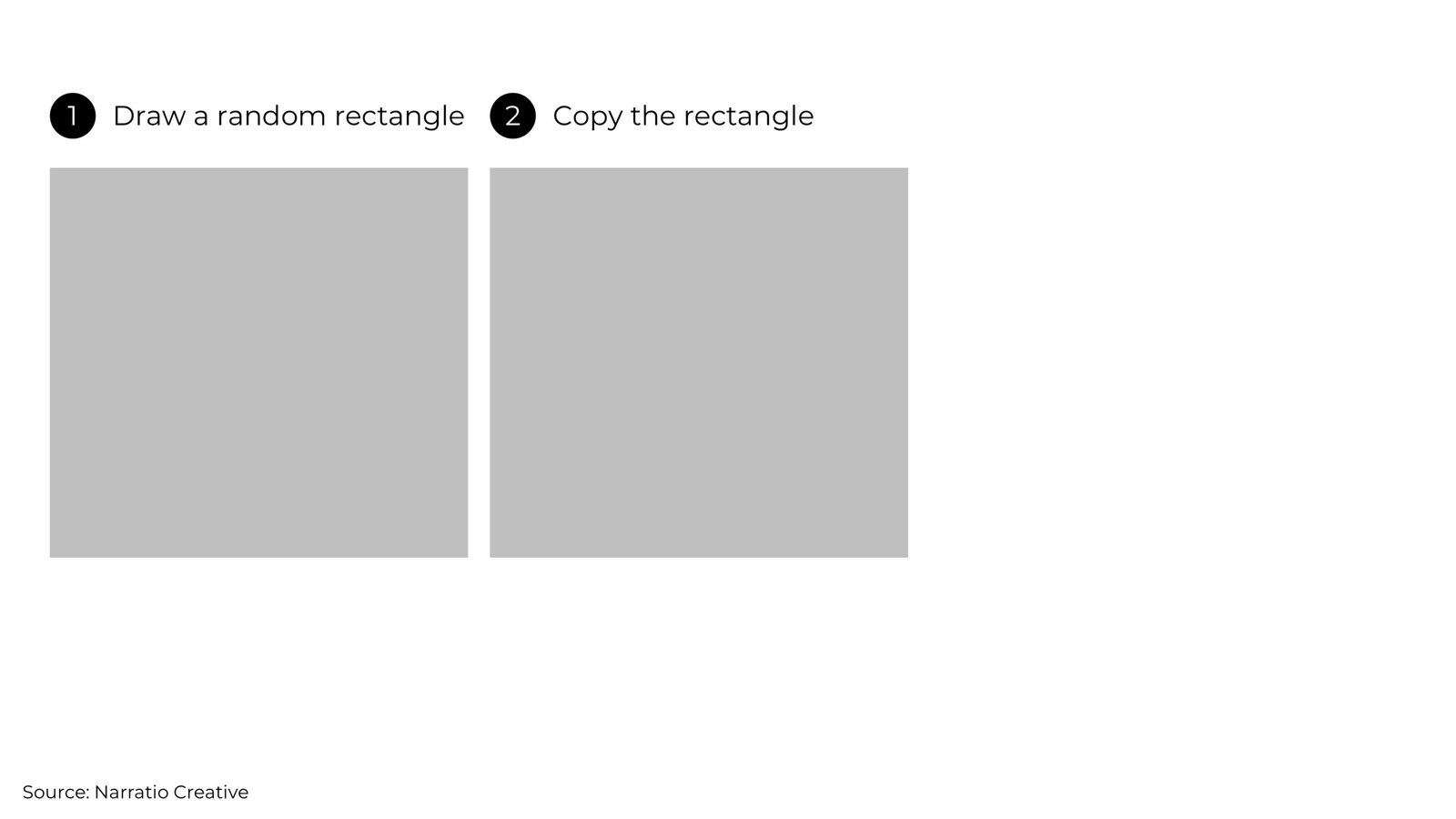
- Press Ctrl+Y to duplicate the rectangle again.
*Tips #3: Ctrl+Y will repeat your last action

- Group the rectangles (*important), then resize and reposition the grouped objects to fit your desired area.

- Voilà! You now have a 3-column layout with perfectly matched dimensions and consistent spacing.
With your foundation in place, simply add your content within each column, using the boxes as your alignment guide.

You can use the same method to create multiple-columns layout with perfect consistency.
#2: Rows Presentation Page Layout
The rows layout organizes content in horizontal bands across your slide. This arrangement maximizes screen width and creates a natural reading flow.
You can create 2 rows, 3 rows, 4 rows, or even more, depending on your needs.

Row layout takes maximum advantage of your slide’s horizontal space, making it ideal for heavy content, timelines, or tables.
Here’s an example of a 2-rows layout:

Let’s use the ‘Stacking Box’ method to create the rows presentation page layout.
- Draw a rectangle on your slide, at random size.
- Hold Ctrl and Shift while dragging to duplicate the rectangle vertically.

- Press Ctrl+Y to duplicate the rectangle again.

- Group the rectangles (*important), then resize and reposition the grouped objects to fit your desired area.

- And there you go, a 3-rows layout with perfectly identical spacing and distribution.
With your row structure in place, you can now add your content within each row, using the boxes as reference.

#3: 2×2 Presentation Page Layout
The 2×2 layout creates four equal sections on your slide, perfect for presenting related but distinct concepts.

The 2×2 layout works especially well for matrix presentations (like SWOT analysis) and automatically gives your content a more graphical look.
Here’s an example of a 2×2 layout:

Creating 2×2 presentation page layout is super easy using the ‘Stacking Box’ method:
- Create two side-by-side rectangles

- Hold Ctrl and Shift while dragging to duplicate both downward simultaneously

- Group all 4 boxes, then resize and reposition the grouped object to fit the area you want.

- And there you are, a 2×2 layout for your content.
Want to make it more engaging? Try these creative touches:
- Change the corners to round corners for a modern look
- Add connecting icons between boxes to show relationships

Remember: You’re not limited to just 2×2. You can easily adapt this method to create 3×2, 2×3, or other grid variations. The key is to maintain consistent spacing and alignment throughout.

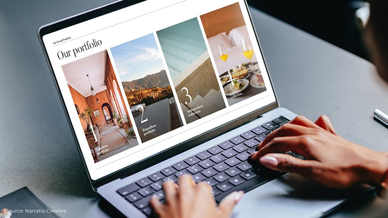
#4: Grid Presentation Page Layout
Grid layouts combine aspects of columns and rows to create versatile, multi-section slides.

You can vary the size of different sections depending on your content. For slides with more complex structure, grid layouts are the ideal solution.
There are two ways to use grid layouts.
01 Full-screen Grid Layout
Full-screen grid layout utilizes the entire slide space, extending content from edge to edge. This approach eliminates traditional margins to maximize visual impact and create powerful, contemporary designs.

Key Design Principles:
- Eliminate all margins
- Use full-bleed images and backgrounds
- Create distinct content sections
Here’s an example of a full-screen grid layout, creating a modern and immersive visual experience:

Full-screen grid layouts excel in digital presentations, brand showcases and product launches which benefits from maximum visual power.
02 Grid Layout with Margin
The second approach to grid layouts involves maintaining traditional margins around your content.

This method balances professional spacing with visual clarity, making it a popular choice for business presentations.
By incorporating margins, your slides appear cleaner and more polished, allowing the content to breathe and reducing visual clutter.

With a grid layout, you gain flexibility to adjust the size and proportions of the boxes. As long as the elements are well-aligned, the layout will remain visually appealing and effective.

Looking for inspiration?
Explore our 4 Ways to Create Professional Business Layouts to add creativity and flair to your grid designs!
#5: Full-screen Presentation Page Layout
Full-screen layouts use the entire slide to emphasize a single, impactful message. This style often features a background image with minimal, striking text, making it perfect for cover pages or storytelling slides.

The key to this approach is to keep the messaging short and impactful. Apple, is known to be a big fan of this approach.

↑ Steve Jobs at the iPhone launch
This type of layout is immersive and impactful, making it ideal for cover, divider, and storytelling presentation.
Here’s an example of full-screen layout used as a divider:

And here’s an example of full-screen layout used as a content slide:

Creating a full-screen page layout is quite straight-forward:
- Add a high-quality image as a full-slide background and crop it to fit.

- Apply a semi-transparent overlay to ensure text readability.

- Place your message atop the image

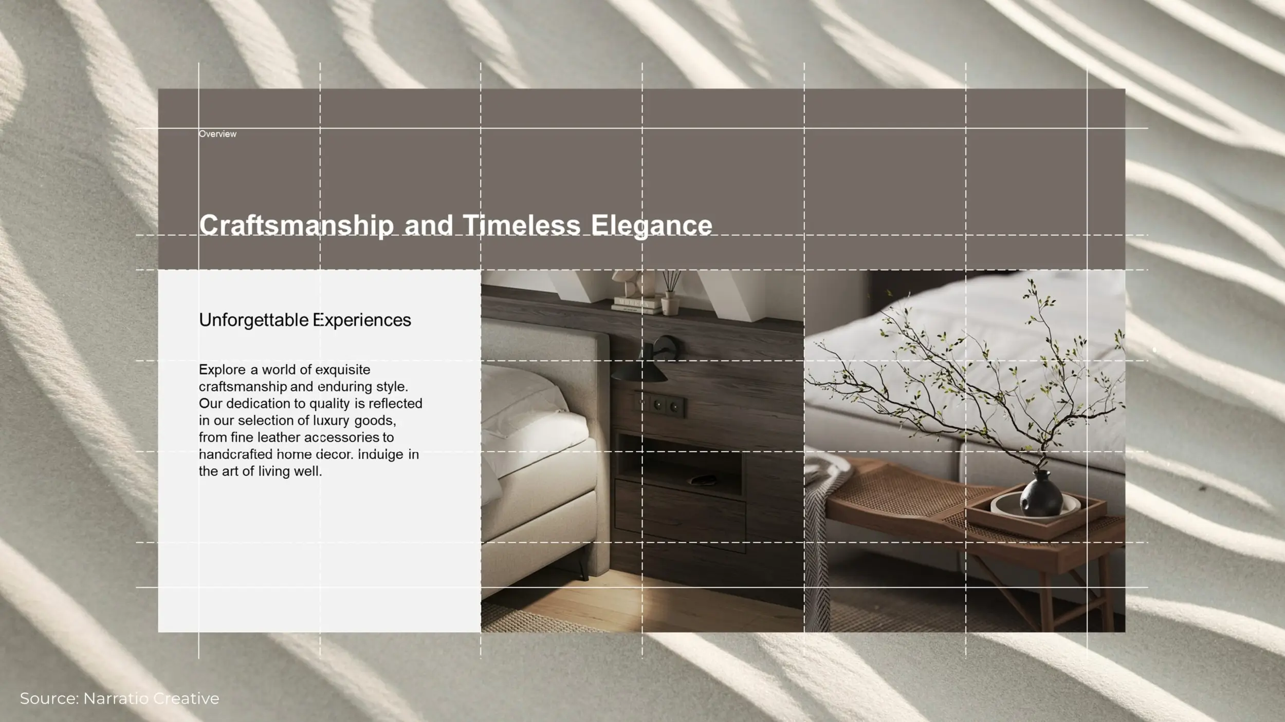
Even when using a full-screen layout, it’s essential to structure your content with the help of invisible alignment guides. These “invisible boxes” ensure that your elements remain organized and visually cohesive.
In the example below, each group of information is neatly aligned within these unseen boundaries.

In this example, the header stretches across the top section, while the introductory paragraph on the left and the main body text on the right are precisely aligned to maintain balance.

Even when crafting a full-screen layout without visible boxes, it’s essential to design with invisible alignment guides in mind to achieve a cohesive and effective structure.
Presentation Page Layout Conclusion
By mastering these layout techniques, you can transform your slides into visually appealing and professional designs:
- Columns Layout for structured vertical alignment.
- Rows Layout for horizontal organization.
- 2×2 Layout for equal distribution of content.
- Grid Layout for ultimate flexibility.
- Full-screen Layout for impactful messaging.
Ready to transform your presentations? Start with the simple columns layout and gradually work your way up to more complex arrangements.
With practice, you’ll find yourself naturally choosing the perfect layout for any content type, creating presentations that not only look professional but effectively communicate your message.